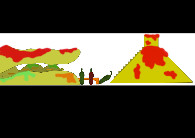
The process of the level design had began with myself and Tom breaking down the levels into countries and types of dishes to that country to which Tom was given the role of the level designer and anything to do with the level. Creating the concept art had been pretty much similar to how we approached the work in our other project where Tom would set out the level design and i would use that as a template to do a piece of concept art and that method carried over to our own project. As you can see from the first image Tom had sketched out the level design into seven pieces to which i had pieced together then realised that breaking the Canadian level into two section would be much easier and quicker to work with then constantly zooming into work on a specific area. So after going round Tom's sketched version of the level and making a much clearer outline i was ready to start adding the colour and because we chose to have Canada as a dessert dish and as shown in Tom's designs i used a pallette of brown, with mixtures of contrasts of the colour to represent chocolate as chocolate is constantly used within desserts. I also added various colours to objects within the level such as butterscotch fingers, strawberries, pancakes and more but once i had done as much i had done within the time the time that i had i had uploaded the unfinished pieces of work to myself and Tom's Facebook page and Tom had told me that the use of brown through various contrasts doesn't help as it flows into one big piece of food rather than individual pieces of food, so when i have the time to return back to the images i will change the level to allow certain areas to stand out and not blend into one.
Now, i had gone back to the Canada level and had redone areas of the level to make sure that it doesn't go into one big pieces of food, this was done through the change of the ice cream and bringing colours of raspberry and mint along with finishing the other colours of the marshmallows which add differences within the concepts. At this point i realised that i had spent too much time trying to get this perfectly right and felt that i should hurry things up and just place both half's together and see the overview of the whole level and i was quite satisfied with the result although i did realise that i could have done certain areas much better the fact that i had stopped when i did made me realise that i would have spent way too much on something which shows what was intended and did not need any more polishing because there is more work that follows which needs attention rather than this one piece of concept taking up my time.
 The reason i listed rigging and animating as one of my deliverable is solely down to my previous animations which wasn't my best and i felt that having the awareness of the animating process would help in a CV and to reestablish my skills at animating. The thought process of rigging became much clearer to me and i noticed and understood why i had to do certain things which would affect a later piece of movement. So i began the rigging process by adding a skeleton and joints to particular areas of movements such as elbows, hips, neck and so on but then once that had been done i had to create the method of movements so adding controls to those specific joint movements.
 Once that was in place i had to bind the skeleton to the model and then i had started to restrict particular movements such as the elbow moving in directions it shouldn't but also adding new forms of movements through IK handles to allow a more precise range of movement for something such as a heel movement. This process is daunting in trying to get the right angles and forms of movements before locking in the range of movements of the character but i was able to understand the thought process behind the locking of controls and in my previous character model i worked at a much tighter and free modelled character to which his feet weren't flat and that is where i realised why i needed to keep the feet flat to the floor and is something i noticed in the controls process as it made the workflow much smoother and relaxing.
 Once the handles and controls were set i of course tried the controls out to see their movements and found anomalies in the characters movements from stretched legs to expanded arms and this at which point weight painting comes into affect. I had to do alot of weight painting and moving the character into various positions and as you can see in the image i had limited the amount of edge loops in certain areas which really did come in effect once the leg started to be positioned but weight painting had allowed me to smooth out the leg without adding edge loops. In the end the positions i place the character in weren't as streatched as before but looked much more fluid and is now ready to be used for animating.