Above is the rendered walkcycle animation of which from the playblast version you can tell that it needed fixing and when i went back into Maya i found that the frame settings were wrong and needed changing to real time 24 frames per second. Once i had done that i had to go back into the key frames of the walkcycle to make the animation flow much better but i had also needed to make areas of the model to animate where as before the movements weren't animated and i had to do this within the day as this clean up process was pretty much close to the deadline making other parts of the projects to fall back on the time, but with the animation this is the stage at which i ended upon at the end of the day and i know that there is much more room for improvement but due to the circumstances that time had to be limited.
Above is the rendered turnaround animation of Ned Bunsem in a pose ready to attack the enemies with his sauce gun.
Above is the rendered animation of Ned Bunsem of which i had to redo because as you could see in the playblast version the speed of the animations was pretty slow and so once i went back into Maya i found that i had not been playing the animation in real time 24 frames per second which after updating the setting the frames needed updating to the setting of 24 frames per second so using the graph editor i was able to push back key frames and set them at a pace of which worked much more efficiently to end up the animation you see above.
Above is the rendered
turnaround animation of Super Ned the concoction of boredom.
Showing posts with label Ifraz. Show all posts
Showing posts with label Ifraz. Show all posts
Monday, 16 April 2012

Monday, 9 April 2012
Ned Bunsem Animating - Super Ned
Now Super Ned wasn't planned but rather something i had done quickly just because i was bored with animating Ned so i had taken a new scene consisting of the rigged Ned and just positioned him into a hero pose and modelled a quick cape and thus Super Ned was born and after i had done that i posted a quick render to Tom and said that this could be an unlockable costume and this is something Tom had mentioned previously where the use of social networks could help to unlock content.
Ned Bunsem Animating - Turnaround
 Now for the turnaround animation i carried on my earlier notion in a previous blogpost where i mentioned that when i used the weapon modelling as a means of reintroducing myself to Maya and being able to use that model somewhere down the line, well here it is. I had taken the attack pose concept art and used that in the turnaround animation however there had been a problem with the positioning of Ned's left had as you can see it acts as a placement for the weapon where as the concept art he is hold the weapon. The reason for this is due to the rig prohibited the geometry to bend in that position as it would rotate so badly and had been substituted by this other perspective, which i feel still goes along with the pose.
Monday, 2 April 2012
Ned Bunsem Animating - Walkcycle

 When animating the walkcycle there was much more of a problem as soon as i started to animate there would be a problem with the models geometry and rather than weight painting then i had left it till the end when i had all the key movements set and started to weight paint rather than moving the leg and constantly going back and weight painting. But along with that problem the fluid movement of the leg was an issue where once the foot hit the ground it seemed like it took a little bounce so i had to refer back to the graph editor and tidy up the animation to which i'm still not satisfied with but the issue i see now is the pace of the movement an issue i feel can be rectified through final cut.
Ned Bunsem Animating - Idle

 One of the animations listed as my deliverable was an idle animation and what i had chosen was for the main character Ned Bunsem to be looking side to side and then start to wave, simple and friendly. Whilst positioning Ned in key poses from side to side i din't really find a problem that was until i started to animate the wave in which i found a dip in the left shoulder of Ned and couldn't really sort it out through the weight painting and had to lower the height of the wave and along with that, smooth the animation using the graph editor as the animation wasn't flowing quite the way i wanted, but in the end i had done the animation to where i had been satisfied.
Monday, 26 March 2012
Ned Bunsem Rigging, Handles and Weight Painting
 The reason i listed rigging and animating as one of my deliverable is solely down to my previous animations which wasn't my best and i felt that having the awareness of the animating process would help in a CV and to reestablish my skills at animating. The thought process of rigging became much clearer to me and i noticed and understood why i had to do certain things which would affect a later piece of movement. So i began the rigging process by adding a skeleton and joints to particular areas of movements such as elbows, hips, neck and so on but then once that had been done i had to create the method of movements so adding controls to those specific joint movements.
 Once that was in place i had to bind the skeleton to the model and then i had started to restrict particular movements such as the elbow moving in directions it shouldn't but also adding new forms of movements through IK handles to allow a more precise range of movement for something such as a heel movement. This process is daunting in trying to get the right angles and forms of movements before locking in the range of movements of the character but i was able to understand the thought process behind the locking of controls and in my previous character model i worked at a much tighter and free modelled character to which his feet weren't flat and that is where i realised why i needed to keep the feet flat to the floor and is something i noticed in the controls process as it made the workflow much smoother and relaxing.
 Once the handles and controls were set i of course tried the controls out to see their movements and found anomalies in the characters movements from stretched legs to expanded arms and this at which point weight painting comes into affect. I had to do alot of weight painting and moving the character into various positions and as you can see in the image i had limited the amount of edge loops in certain areas which really did come in effect once the leg started to be positioned but weight painting had allowed me to smooth out the leg without adding edge loops. In the end the positions i place the character in weren't as streatched as before but looked much more fluid and is now ready to be used for animating.
Adding Backgrounds to the Levels
After completing the concept art designs for the game levels i knew that they were missing the background image and that had been because i wanted to produce that separate and save time as this background image would be used within the scene of the game level. So i started to develop a basic layout of the games background and because i didn't want to take the attention away from the viewer of the actual game level i didn't go into detail. The design of the background was all down to just creating that ice covered fridge interior where the fridge has been freezing and producing ice because Ned Bunsem had lowered the temperature to keep the food landmarks intact
and also within the icy fridge interior you would see bits of food and also because this is an image for the back of the level an area which wouldn't fully be seen i was able to save much more time in re-using the image and just adding new pieces of food or changing bits around to create a difference between the images. Below are the backgrounds on the left and their use in the scene of the level on the right and i feel it goes well with the level layout not really taking away from the level but also adding an interest as it captures some attention.


Monday, 19 March 2012
Level Concept Art - America


After the two methods of producing the concept art with the Canada and Mexico levels i decided to reuse the method from the Mexico level and started to block out basic colours of the level after splitting the level into thress sections because the design was much larger than previous level designs. Once again the Mexico method served its purpose and was able to allow me to produce the concept of America to where i hadn't lingered on the same area for hours on end but rather worked my way through the level design and able to show visually of what the level will look like, at the end i am happy with the final piece once i had joined up the individual areas of the level but i always feel like it's not good enough but also realised that if i try to take this further it would look much different from the previous concept art pieces and i would have also spent too much time on this piece, however at the end both myself and Tom were happy with the layout of the level and didn't require any additional work and that i should move on to the next objective.
Level Concept Art - Mexico


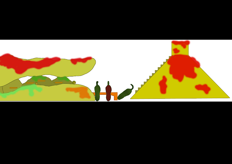
After realising how much time i had spent on the Canada level i went the other route in the concept art process of the Mexico level, rather than do the outline i would basicaly block the colour of the level and then work from there and now looking at the images i think this should have been the process from the start as it had been quick and at the end suits the level design from the simplicity of it's design as you can look at the Canada level which didn't really look as clean and finished as the Mexican level. Once again i had broken the entire level into two sections and worked from there by colour blocking the entire level and then worked on by adding sauces and just having the level look much like a platform level where you can look at the concept art and see the start to the end and how you would work your way through the level. At the end i feel that this process really stuck with me and will be taken into the concept art of the America level because looking at the end result i had gotten the end product right and in a quick process and yes, there is much more that i coud improve on but this wasn't something i had thought about when listing that i would do multiple briefs.
Monday, 12 March 2012
Level Concept Art - Canada


The process of the level design had began with myself and Tom breaking down the levels into countries and types of dishes to that country to which Tom was given the role of the level designer and anything to do with the level. Creating the concept art had been pretty much similar to how we approached the work in our other project where Tom would set out the level design and i would use that as a template to do a piece of concept art and that method carried over to our own project. As you can see from the first image Tom had sketched out the level design into seven pieces to which i had pieced together then realised that breaking the Canadian level into two section would be much easier and quicker to work with then constantly zooming into work on a specific area. So after going round Tom's sketched version of the level and making a much clearer outline i was ready to start adding the colour and because we chose to have Canada as a dessert dish and as shown in Tom's designs i used a pallette of brown, with mixtures of contrasts of the colour to represent chocolate as chocolate is constantly used within desserts. I also added various colours to objects within the level such as butterscotch fingers, strawberries, pancakes and more but once i had done as much i had done within the time the time that i had i had uploaded the unfinished pieces of work to myself and Tom's Facebook page and Tom had told me that the use of brown through various contrasts doesn't help as it flows into one big piece of food rather than individual pieces of food, so when i have the time to return back to the images i will change the level to allow certain areas to stand out and not blend into one.


Now, i had gone back to the Canada level and had redone areas of the level to make sure that it doesn't go into one big pieces of food, this was done through the change of the ice cream and bringing colours of raspberry and mint along with finishing the other colours of the marshmallows which add differences within the concepts. At this point i realised that i had spent too much time trying to get this perfectly right and felt that i should hurry things up and just place both half's together and see the overview of the whole level and i was quite satisfied with the result although i did realise that i could have done certain areas much better the fact that i had stopped when i did made me realise that i would have spent way too much on something which shows what was intended and did not need any more polishing because there is more work that follows which needs attention rather than this one piece of concept taking up my time.
Monday, 5 March 2012
Ned Bunsem Textured

 Here is the complete and textured model of Ned Bunsem and as you can see from the video above there had been areas of which needed individual focus when it had come to texturing such as the N symbol on Ned sweater and the freckles on his cheek. But generally the visual representation of the character Ned Bunsem uses the various colours quite well on the model as each colour is important to the area that it covers and is in a colour tone will not be used in the level texture allowing the character to flow through the level without a clash of colours. Also the use of simple block colours is favourable to the model as additional detail could be streatched when animating the character but where the character is at and the texture myself and Tom are happy with the current stage and feel that haaving the character simple is better than having details which would hardly be noticed in gameplay, so we are looking at keeping the colour pallette of our game to a minimum.
Ned Bunsem UV Mapping
 The next process which was needed was the process of UV mapping the Ned Bunsem model which is a difficult process in which i had to maintain the areas of the model in the UV map to allow myself to know what areas i am working with and as you can see i did break the areas such as arm, leg, hands and so on to allow myself to focus on certain areas. The fact that the areas had been broken into separate pieces and done through only have of the model is because i realised that the model would be symmetrical would not need additional UV maps so i could focus on one half but when it had come to adding individual bits of details i would do so by taking the faces of that explicit area and UV mapping it to be textured separately. The reason why the route of taking away individual faces didn't matter was due to the model consisting of block colours which is why the high level UV mapping was not needed, for example taking the face and having it UV mapped separately, where as Neds face is primarily made up of his glasses and his smile and right now i am at the stage of texturing Ned with block colours as areas of detail, the reason for this is because the size of the character is not at scale of which high levels of detail will be noticeable.
Monday, 27 February 2012
Ned Bunsem Modelled
After taking a break and lowering the weapons polycount i returned back and started to finish the model of Ned Bunsem by completing the modelling of his arm and hand and then added the glasses after mirroring the model of Neds body as most of his shape and body is symmetrical where as his hair and the freckles on his right cheek are not but i will be adding them through the texture process. I think looking back at this model there is room for improvement, just like anything else but i feel that where i am at it and comparing it to my previous model this model shows my modelling skills have improved to where the model is much smoother and the methods of coming up with a model such as Ned as i learned to keep any figure modelling in a T-pose and to work from a cube and extract into the shape you are working with. Considering the amount of faces used in the model my thoughts are at a stage where i am confident in the stage at which the model is currently at but feel that their is an improvement that can be made where i could lose faces and once again i believe that working at the scale i am currently at is why i am trying to go into much detail with the modelling of the character and as this model is aimed at IOS and Android devices which had been reminded to me from one of the feedback i received, then perhaps the need for a lower amount of faces is expected and i should lower the faces but when doing so i came across many faults in the shape of the model and when removing certain edge loops that they will become a problem once animating so i had decided that i will try to keep the model at the current stage where i do believe it is at a level which acceptable for an IOS and Android platform.
Weapon Polycount Lowering
As mentioned in the previous blogpost i had gone overboard with my polycount which is evidently shown in the above video and i had planned to go back and model the weapon to where it shows the design of the weapon and having a better polycount. So i had started with the current high poly model and started to remove unnecessary edge loops to lower the faces and in the process retain the weapon shape to where it is visually similar to the design and is recognised by that fact and not needing a second glance. As you can see in the video below the amount of faces has been lowered by near half of what it had been and still retains the shape and look of the design so i am happy with the stage at which it is at however i still feel i could lower the faces more as i am looking at the weapon at a large scale where as when it come to being used the weapon will be a much smaller size, a size can get away with a smooth shape but another factor is that i need to finish off the Ned model as well as the other but i feel the use of the weapon at the end of the projects is in a pose so lingering on the model is not necessary for now.
Modelling the Weapon and Character (Ned Bunsem)

 With my role covering the character and concept art side of the project i had done much of the concept art and the designs and ideas for the characters which the next step of my deliverable was to produce a 3D model of the character and have him rigged and animated. So rather than jump into the deep end of modelling a full character, i decided that since it had been a few months since my last use of Maya that i should model something quickly and simple to reacquaint myself with tools and modelling. So i chose to model the weapon which was simple in it's design and could serve a purpose in posing the character so there is a use later on. I kept the model close to the design and i believe that perhaps in doing that i had gone overboard with the polycount and which is why i will have to go back into the model and lower the polycount to where the model retains what it is trying to show but also keeping the polycount as low as possible.

 After the weapon model i was ready to take on a much more of detailed model coming through the modelling of the main character. I tend to start a modellign process by starting with a cube and then extruding to the design however i tried a new process in which you use a plane and mould that plane to the design, this process had been one which i had seen Chris do. But when i had tried the same method i couldn't get the process right as i ended up starting with the plane but once i tried to mould the shape of the design i wasn't able to form the shape correctly and rather than carry on and refer back to my comfortable method as this will allow my pace of modelling to be much quicker and i feel that the plane method will be best suited for a simpler model such as the weapon. Once i had gotten the modelling process underway i had confidently been able to model the shape of the character from head to toe and have come upto the modelling of the arm. Throughout the modelling of the character the design was rounded but simple so i had to keep the smooth round look for the model going for all the areas but i had come across problems where the model would have uneven edges and wouldn't be smooth. So i started using a method in which i could smooth the model then remove those additional edges and vertices so the polycount would stay the same and through that smooth tool i could maintain a smooth and rounded looking model without any additional edges. With that in mind my next process is to finish off the model and then work on the texture.
Monday, 20 February 2012
Character Poses
Now that i had done the colour variations of all characters and the weapon and we had chosen the colours of these designs i was able to form the whole of these areas together and show what could happen in the form of concept art. So i began each design by quickly sketching up what the scene what entail to which would then be redone in a more clearer and clean visual. From that instance i will be able to add the basic colour layout of all the area of the scene and then finally add the lighting to the scene as well as the shading and shadows. Also in the final scenes with the lighting i added the background shade to give a sign of th edirection of light but also this can be changed into the food landmarks as the backdrop.


In the above three stages of the scene, i had done a design showing the main character in Ned Bunsem attacking the mini boss/ obstacle the cockroach of the level with his water gun weapon which has tomato sauce as it's ammo to which when hit onto the enemy it covers the enemy and makes them stuck in a shell of sauce. That is what i am trying to show through this design that Ned is using his weapon in spraying the cockroach and trapping the cockroach to prevent any more damage to Ned's food landmarks.


In the above three stages of the scene, i had done a design showing the main character in Ned Bunsem attacking the main boss of the game the rat boss with his water gun weapon, shooting the tomato sauce at the oncoming rat boss who is able to not be stopped by the sauce and this is where the gamer would have to work his way through defeating the enemy.


In the above three stages of the scene, i had done a design showing the main enemy character in the rat boss posing on what would have been the Eiffel 'cheese string' Tower portion of one of the levels but as we chose to do another level i thought that doing a quick pose concept art would help in showing what could have been as we mentioned doing food landmarks such as the Eiffel Tower as an upside down cheese string and so i felt i should quickly do a design of what it would have looked like.


In the above three stages of the scene, i had done a design showing the main character in Ned Bunsem attacking the mini boss/ obstacle the cockroach of the level with his water gun weapon which has tomato sauce as it's ammo to which when hit onto the enemy it covers the enemy and makes them stuck in a shell of sauce. That is what i am trying to show through this design that Ned is using his weapon in spraying the cockroach and trapping the cockroach to prevent any more damage to Ned's food landmarks.


In the above three stages of the scene, i had done a design showing the main character in Ned Bunsem attacking the main boss of the game the rat boss with his water gun weapon, shooting the tomato sauce at the oncoming rat boss who is able to not be stopped by the sauce and this is where the gamer would have to work his way through defeating the enemy.


In the above three stages of the scene, i had done a design showing the main enemy character in the rat boss posing on what would have been the Eiffel 'cheese string' Tower portion of one of the levels but as we chose to do another level i thought that doing a quick pose concept art would help in showing what could have been as we mentioned doing food landmarks such as the Eiffel Tower as an upside down cheese string and so i felt i should quickly do a design of what it would have looked like.


In the above three stages of the scene, i had done a design showing the main character in Ned Bunsem attacking the cockroach mini bosses when his ammo is all out and his attack comes in the form of realeasing gas through burping and farting which we felt worked and limited the weapon to ammo and when the gamer is all out he is able to burp and fart to knock out or cause the enemy to become dizzy for a moment allowing the gamer to get past.
Main Enemy Characters, Cockroach Mini Bosses - Colour Variations


Once i had done with the cockroach turnaround design i started with the colour combinations by looking back at the research and found that the shade of the colours used for the cockroach are what distinguish the cockroach from other insects and so i began to use very dark and between light and dark shades for the colour combinations on the cockroach to show that the character is neither as evil as the rat nor good as Ned but in between but on the side of bad. So i went along with this and use more of the dark shades of colour but also colours that are between the light and dark aspects of colours such as the oranges and the browns and from this i began to work around the colour combinations to use not the one aspect of colour combinations but use different colours for the body, limbs and back shell of the cockroach. Once again there wasn't much of a difference of colours and so i kind of lingered on the same area of colours which although don't look too close to each other it is very instant if you look back at each of the colour combinations as the only difference is the brighter aspect of the colour which makes the choice in the cockroaches colours limited however in the final colour combination cockroach i tried to merge most of the colours used and single out certain areas to which i feel will work quite well if chosen.
In fact we had deciced together that the final colour combination is what worked well because it uses various colours to distinguish certain areas and allows the character to stand out. Also we felt that because the colours don't linger in either dark or light colours but instead in between it works well as it holds that creepy, crawly instinct when seen based on the colours.
Subscribe to:
Posts (Atom)